Press Release: BrickLink Announces Brand Refresh…we provide a lot of commentary.
Below is the press release, verbatim. Comments follow.
UNDER EMBARGO UNTIL JUNE 17th @ 20:00 UTC
Refreshed brand icons and terms inspired by BrickLink heritage
Irvine, California, June 20th, 2026: Over the past few months BrickLink has been making some important improvements to its website so that it’s easier for mobile users to navigate. As part of that work, we will be refreshing the BrickLink wordmark and some of our icons so that visitors can more easily differentiate between what’s available across the website and to make navigation easier for those viewing bricklink.com on smaller screens.
From June 2026, visitors to BrickLink.com will start to see refreshed designs for the main BrickLink wordmark, new icons for the Marketplace and Community as well as refreshed icons for the Designer Program and Studio. The changes will be rolled out gradually across the entire website as content is updated in phases as part of ongoing replatforming work. While the introduction of the refreshed designs won’t impact website functionality beyond improving navigation, this is an important and exciting step in the website and BrickLink brand journey overall.
Taking inspiration from some of the original BrickLink logos, blue and green will be prominent colors of the refresh with the two new Marketplace and Community icons using those colors. BrickLink founder, Dan Jezek, originally chose those colors for their connection to the natural world. When discussing the meaning of the original logo, Dan explained:
“The blue and green colors are colors of nature. The blue on top represents the skies in that BrickLink has no limits on where it can go. The different shades of green represent peace and that this is a friendly site with a lot of friendly people (which it is) and is a place to come to relax.”
Daniel Jezek, BrickLink Founder
In addition to those two new icons, the Designer Program icon will also be refreshed. From July onwards, the naming convention for the ‘BrickLink Designer Program’ will also be shortened to ‘Designer Program’ to be more concise and to reduce duplication. Finally, the way we describe Designer Program series and stages will also be changing in the future to help make it clearer what series are at what stages. From 2028 onwards, we will describe the BrickLink sets released within a year as a ‘Collection’ and will describe the release cycles as ‘waves’ instead of ‘series’. So, for example, when this change is introduced at the start of 2028, what would have previously been called ‘Series 12’ will now be called ‘2028 Wave 1 Collection’.
The Studio icon will also be refreshed, continuing to use the four colors of the other icons to celebrate the Studio as the core engine on the platform. All four icons will follow a consistent, simple 1x1 LEGO® tile design so that they stay true to the overall BrickLink brand while also being easy to tell apart within a clearer visual system.
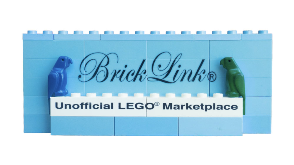
Visitors to bricklink.com will also see the green and blue parrots that were part of the original logo appearing more often across the website in the months ahead. For Dan, as well as the wider community, the parrots always held an important significance in representing buyers and sellers being brought together by the brick. In that spirit, the parrots will continue to be an important part of BrickLink online where they’ll appear in fun ways and continue to represent our incredible BrickLink community. As well as the parrots, eagle-eyed fans might spot that the white 1x12 brick from the original logo has been used within main BrickLink wordmark… except in the redesign it’s been transformed into two 1x2 plates that are stacked on top to represent the ‘L’!
The updates to the wordmark and icons will also be reflected on social media channels, event assets and future physical box art. BrickLink packaging will feature the updated designs from 2028.
As Head of BrickLink, Steven Lee recognises, BrickLink continues to evolve while still staying deeply connected to the original mission of bringing buyers and sellers together:
“The refresh of the wordmark and icons celebrates everything the community has built and recognises the breadth of experiences that are now available on BrickLink.com. Simplicity has been key in the designs because they need to help anyone visiting the website to find what they’re looking for at a glance. Inspired by Dan’s original idea as well as the spirit of community past, present and future, the refreshed icons meet our users’ needs while standing as a strong link to the heritage and the future of the BrickLink brand. It’s great to know that connection is so strong throughout the design.”
Steven Lee, Head of BrickLink
Key highlights
The visual design:
- Has been inspired by original BrickLink icons
- Retains the parrots as recognizable brand elements
- Reinterprets the original 1x12 brick as the ‘L’ in the BrickLink wordmark
- Creates a simple system that’s flexible and clear
- Celebrates the BrickLink community and the original idea of bringing community together
Marketplace icon
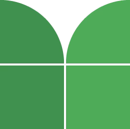
The Marketplace icon represents buyers and sellers coming together through BrickLink. The tiles create an ‘M’. The arches symbolize an ‘open book’ and how members can explore the BrickLink Catalog.
Community icon
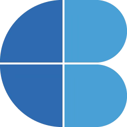
The Community icon creates a ‘C’ within the tile system. When rotated, it also forms a heart and a smile which symbolize the joy of the community and its place at the heart of BrickLink.
Designer Program icon

The Designer Program icon creates a ‘D’. When rotated, it symbolizes an open window and the opportunities the Designer Program offers expert creators.
Studio icon
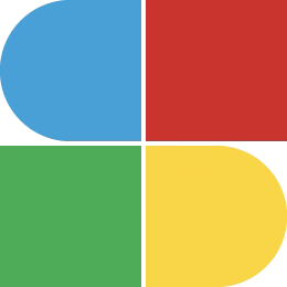
The Studio icon represents the four core BrickLink products coming together into one creative system and is represented by the letter ‘S’.
About BrickLink
Founded in 2000 by Dan Jezek and acquired by the LEGO Group in 2019, BrickLink.com is a community for the most passionate adult LEGO® fans.
BrickLink has grown and evolved over the years, but our purpose remains the same: to connect builders, sellers, and designers to the parts, tools, and resources they need to bring their creations to life.
From Marketplace and Community to Studio and the Designer Program, BrickLink is a place to connect, create, and share your love for LEGO bricks.
Q&A
Why hasn’t the wordmark and icon been updated everywhere on bricklink.com?
In June 2026, we’ll be making the first updates to the designs on bricklink.com. We’ll focus first on updating the main navigation bar which appears across the website. The designs will then be aligned gradually across the entire website as content is updated in phases through ongoing replatforming work.
Will the designs be updated elsewhere?
Yes, from June 2026, you’ll also see updated wordmark and icons on our social media channels. From 2028, the refreshed designs will also appear on BrickLink packaging. And we’ll also be updating our event assets from BrickWorld Chicago 2026 onwards.
Wouldn’t it be better to focus more on improving functionality?
We continue to focus on making improvements to the functionality of BrickLink.com with the current replatforming work set to make the website better (especially for mobile users). Developing the wordmark and icons supports better navigation and develops the BrickLink branding to support improvements to the platform.
How can you be community focused when this change doesn’t reflect community needs?
Community continues to be the heart of BrickLink as the platform grows. While we work to better meet the needs of users, we’re making these updates to make the website easier to use while still celebrating the original BrickLink mission.
Okay. I have a lot to say.
Briefly, because I just can’t help myself:
In the About BrickLink section, the first sentence is accurate. The second sentence is mostly accurate. The third sentence is PR nonsense. In plain terms: bullshit.
The greater community aspect is long gone and community has moved to other platforms. BrickLink has had its share of problems, many if not most of its own creation, and they did not enjoy (and still don’t) being called out for them. BrickLink did not want to listen to the community and chased out many “noisy forum members”. The Q&A section basically acknowledges BrickLink’s ignoring of their community’s wants and needs with the first three answers and owns it. The fourth answer is so divorced from any objective reality that it is laughable. I will cite the recent update of the Add Item page as an example. It definitely did not better meet the needs of users nor make the web site easier to use. When a user has to create a browser extension so the page can be used that is an indication that the needs of users are not being better met by BrickLink. Sixty plus comments and counting in the forum section lay testament to that.
Now that I have that out of my system I want to focus on the rebranding. This will be a technical dissection of the new look from a professional designer’s perspective.
Thing one. Wordmark. Here is what Dictionary.com has to say about wordmark.

The item in question is called a logotype. But we can give BrickLink some points with being as inventive with the word wordmark as they are in their explanation of how wonderful it is.
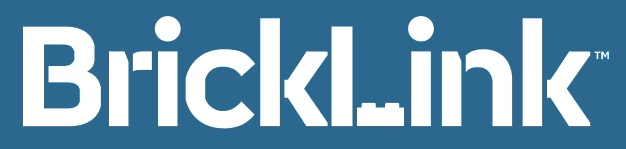
Apologies up front as I am about to go somewhat font nerd and use technical font anatomy terms.
I have been unable to locate the font BrickLink is using as the house font for their display text, so I don’t know the font name. Characteristic of this font is the sliced off edges of the bowls and counters, the rounded parts of the sides of the letters. It is evident here in the B and the c.
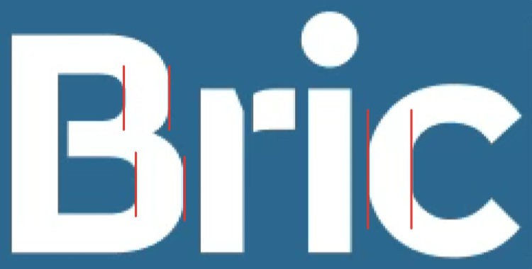
The designer has modified the font by slicing off the arms and legs, effectively turning the font into a stencil font…except on the B where they slice just through the middle of the B, but not the ends.
The decision to not slice the B completely is an inconsistency with the rest of the approach to the modification. Typically a designer does not want to create this kind of visual tension by joining and containing the closed counters, the “holes” in the B. You would want to either slice the stem, the vertical stroke, completely off…which in this case may lead to confusion as the B might then read as 13… or slice through the bottom only, which would release the containment and allow the eye to travel in and out of the space instead of being trapped in it.

Designer’s B

Full slice can read as 13

Suggested more aesthetic B
Another feature of the font is the horizontal stroke connecting the stem to the arm and leg of the k.

Unadjusted k
I do not have the original font to compare, so I cannot be sure if the designer sliced the k and moved the arm and leg to the right or if a cut was made and part of the stroke removed. In either event it seems that that stub of a stroke is something less than elegant. Likely it would be better to have removed the stub altogether. To retain the width of the original character the stump could be removed and the angle of the arm and leg adjusted. If you are modifying the font, you might as well adjust things as needed to retain balance.

Designer’s k

Stub removed

Stub removed, arm and leg adjusted
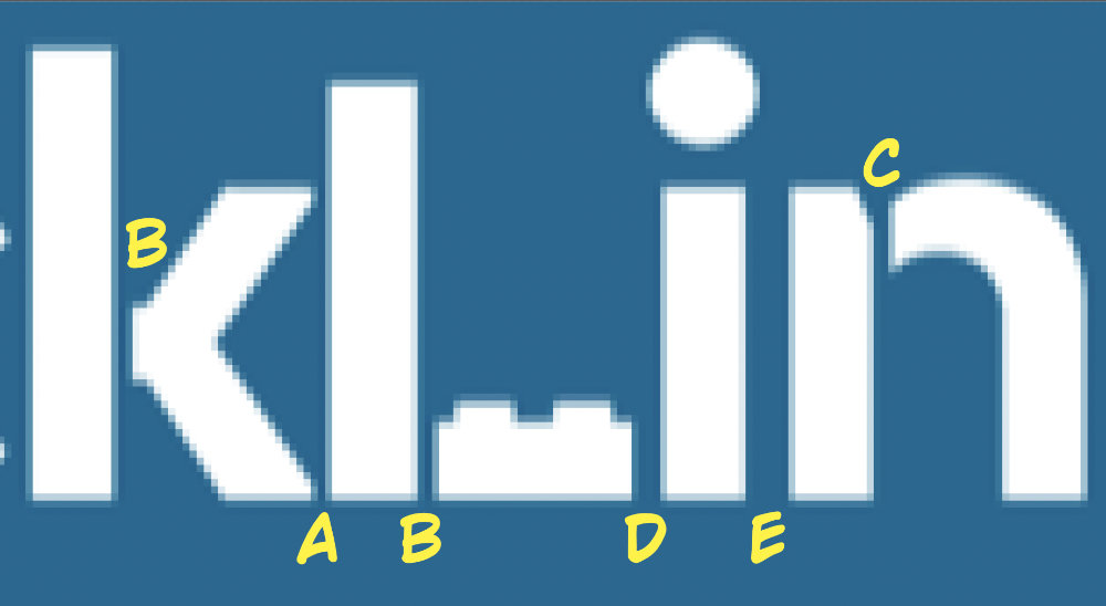
The consideration for using sliced letters introduces another issue with the logotype. Spacing between letter characters needs to be balanced with the slice spaces within the individual characters. Here we see various different spacings at a critical point.
1/4 inch
The smallest space exists between the K and the L (A). Slice spacing within the k and L are similar and are next in width (B). The slice spacing within the n (C) looks slightly wider than that of k and L which appears to be an inconsistent application of the slice motif (maybe not in reality but I am working from a relatively low resolution raster file). Then wider is the space between the L and the i (D) and widest is between the i and n (E).
The spacing variants in play are creating sub-optimal relationships between the letters. The tight space between k and L tie those characters together. The greater spacing at (D) compared to (A) further reinforces the tie between the K and L.
The spacings here do not seem to be considered, much less well considered. The logotype should read as [Brick] [Link]. But with the k nearly kissing the L, and the L being split, and the brick being oddly positioned between the stroke of the L and the i, I keep reading Brickl_ink, at least at a moderately large scale.
Two asides at this point. One: as I am working on this document my son comes into the room and glancing at the screen he says: "Is that the Linked In logo?" I explained that BrickLink was rebranding. I also had to go look at the Linked In logo. And one has to admit with the facts that…
- Link appears in both logos
- both logos use a fat dot over the i’s
- the color schemes are similar
- the font faces and weights are similar
…there is a fairly strong resemblance.

© Linked In
The other undeniable fairly strong resemblance between the new white logotype and the choice of blue background: Brick Owl’s look. Time will tell if whatever the new green and blue look supposedly coming along is not reminiscent of Brick Owl, but with the little shown here out of the gate I would hope BrickLink minimizes the blue and emphasizes the green.
Two: I had to check. I had to check twice that it wasn’t a typo on my part. And it was not. I am going to quote two lines from the press release.
“ …eagle-eyed fans might spot that the white 1x12 brick from the original logo has been used within main BrickLink wordmark… except in the redesign it’s been transformed into two 1x2 plates that are stacked on top to represent the ‘L’!”
“ • Reinterprets the original 1x12 brick as the ‘L’ in the BrickLink wordmark”
Someone clearly did not proofread the release. Besides the embargo date being 17 June and the release stating 20 June (really, BrickLink, really), we witness the claim of original 1x12, emphasis mine: one by twelve, brick. Twice. But later in the sentence it is two 1x2 plates. And I do have to give credit where credit is due, the arm of the L is pretty much exactly proportioned to two stacked 1x2 plates.
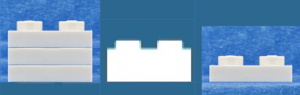
Unfortunately that 2-plate-high proportion is not exactly a common proportion in a brick, and to the “eagle-eyed” fans that is going to stand out as somehow just wrong proportions. If a slice line was added under the top plate to indicate that it actually is supposed to be two stacked plates, that might help, but we immediately get into a legibility issue at small sizes. No doubt the choice of two stacked plates was to emulate the stroke weight of the other characters in the font, but the whole thing is like trying to fit the ugly stepsister’s foot into the glass slipper.
End asides.
When designing a logo or logotype the rule of thumb is that it has to be legible at 1/2 inch. For some anticipated applications, like putting the logo on a pen, considerations should also be made for legibility at 1/4 inch. Here’s how the logotype holds up at those sizes.
1/2 inch
1/4 inch
At these small sizes the characters begin to run together and the slice-apart aspect becomes considerably less pronounced. The impetus for choosing to use the slice was probably the rooted at the desire to use a 1x2 brick as the foot of the L character, and at this scale the bias for using the brick as a visual element fails to communicate effectively and becomes a blob. The height proportions between the stud and the plate base would need to be exaggerated to read as intended at this scale, but in all likelihood that difference is effectively beyond any practical tolerance to communicate what is intended effectively or immediately. The TM has completely disappeared.
Often multiple files are created to deal with these visual issues, and maybe that will be the case when things go live and maybe not. Typical adjustments made to the tiny versions of the logo or logotype are weight changes to the font, increasing the spacing between letters and getting the ® or TM large enough to be legible. In the instance of this logo, if the slice attribute is a key component of the look, then that spacing needs to be adjusted along with the letter spacing. I doubt there is much that can be done in regards to the 1x2 brick element, though.
On to the icons.
A phrase I heard endlessly while in college from one of the advertising department professors was “communicate with immediacy”. And communicating with immediacy is the goal with any interface. Nobody should have to stop and think and figure out things. Interfaces should not be puzzles. So let us keep that at the forefront of our minds as we wander through the icon business.
First, let us take a look at the icons: M, C, D, and S.
These are supposed to represent letterforms constructed out of DOTS™ tiles. I am going to get super nit picky and call the designer lazy. The tiles, indeed the bricks, plates, and what-have-you do not have perfectly square corners. They all have a very slight radius. This becomes evident when tiles are enlarged.
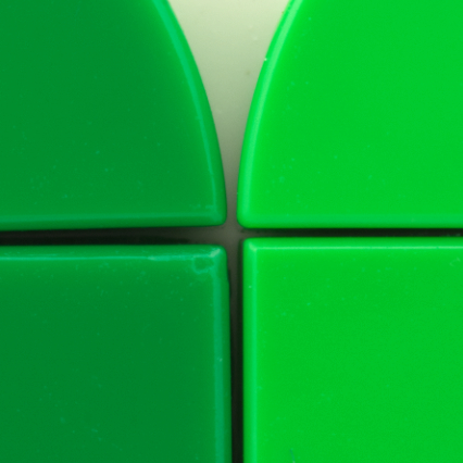
Actual tile edges with radius corners.
Designer tile edges with square corners.
I spent some time in an attempt to create the entire alphabet out of a 2x2 grid of DOTS tiles. Here is the result:
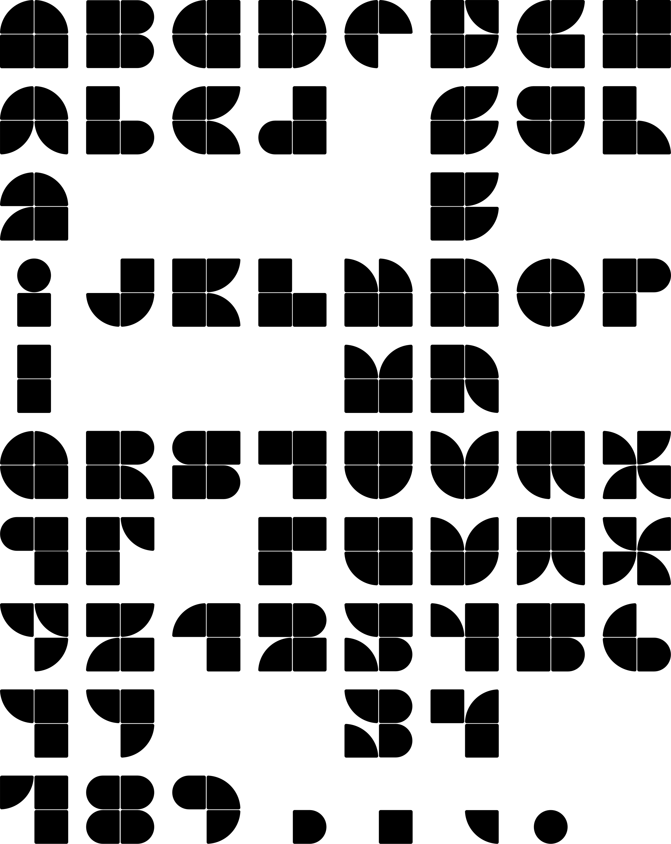
Clearly some compromises have to be made and not all characters are immediately obvious. As these forms do not communicate with immediacy, the concept of using tiles to create letters is an interesting exercise but ultimately a failure in practice.
Presented with these three symbols, what is the first thing that comes to your mind?
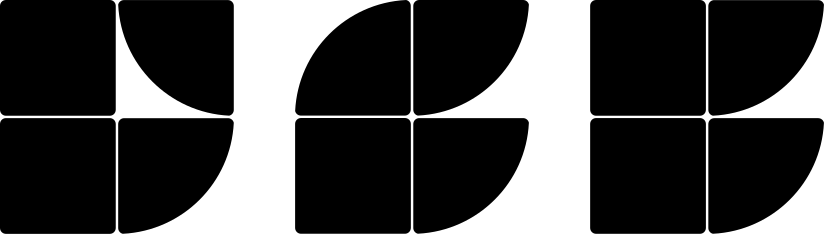
Putting aside that the first thing is probably “what the hell are those supposed to be” I will bet “F” is not even in the running. I will concede that one might reasonably interpret the new BrickLink icons as M, C, D, and S, but with some caveats. The first caveat is that they need to be fairly large.
Given the tile edge divisions, the mind perceives the shapes as separate elements first, then has to have a working understanding of DOTS tiles and LEGO® colors, then need to make a cognitive leap to interpret the icons as alphabet characters before any relative context can be applied. That is quite a stretch. If I am not told that these things are supposed to be alphabet characters representing a word that represents a section of the web site, well, definitely that is not the first immediate thing to enter my consciousness.
M for marketplace.
Okay. Here is the Marketplace icon at a size one might expect to see it being used in the navigation bar. This is at the 1/2 inch (36 pixel) design threshold for logo creation.
What is the first thought when seeing that icon? For me at this scale I thought of plants of some sort. The green color along with the leafy shapes does it for me. For you it may be something else. But I get plant. Does your browser render the tiny white split lines cleanly with no blurring together on your monitor?
BrickLink says: The Marketplace icon represents buyers and sellers coming together through BrickLink. The tiles create an ‘M’. The arches symbolize an ‘open book’ and how members can explore the BrickLink Catalog. Okay. If anybody immediately thinks any of that when seeing the icon please raise your hand.
Being a LEGO fan, and in LEGO context, the first thought I had when I saw the icon at the size presented in the PR document was this:
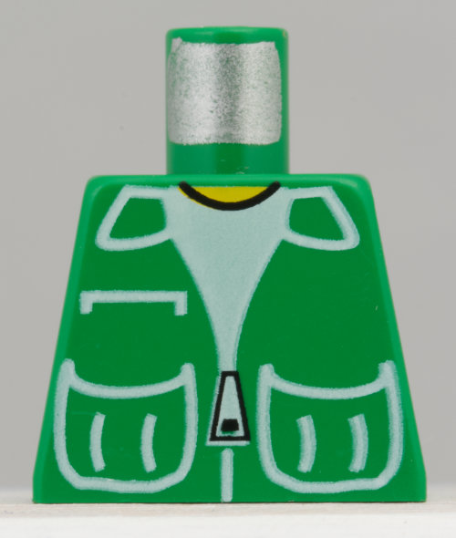
I do not perceive the concept of marketplace or open book or catalog. If that icon is supposed to be symbolizing any of those things it is failing. The little store icon that’s been in use for forever at BrickLink communicates marketplace better.
C for Community.
Where are you on this one? My first thought was sideways blue hippo ass. My second thought was this:
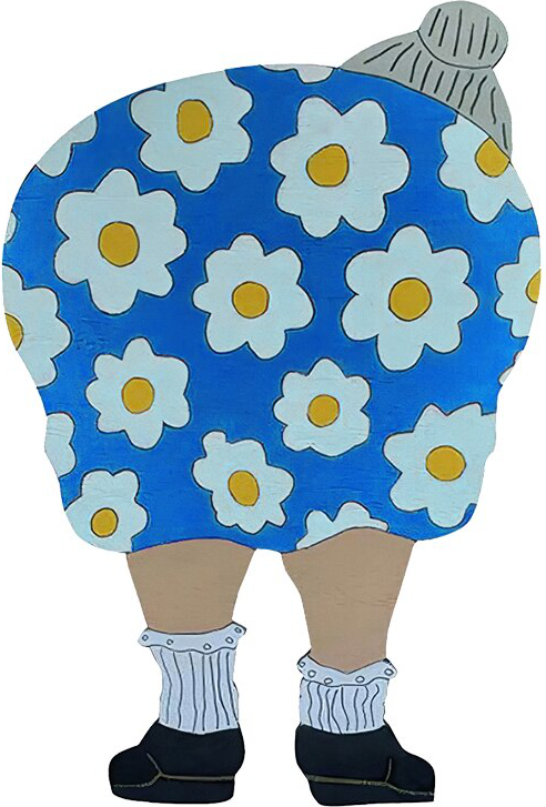
Image taken from vicedeal.com.
When I got to the point that I knew I was supposed to interpret it as a letter, I thought it was a B. Kind of hard to get away from two stacked bumps on the right side not being a B. Exacerbating the situation with this icon is the contrast in the two blues. Perhaps if this was all the same blue I might think it was a C, but the contrast separates the left side from the right side, much more so than the two greens in the M above. B. or maybe CB.
BrickLink: The Community icon creates a ‘C’ within the tile system. When rotated, it also forms a heart and a smile which symbolize the joy of the community and its place at the heart of BrickLink.
Uh-huh. Good thing that was explained to me because not in a hundred lifetimes am I going to interpret that symbol as a heart, nor does it communicate joy of community, nor anything else you might suggest. And what is this nonsense with rotating the icon? What is the point of even bringing up rotating if they are never going to be used that way, and they are not intended to be used that way? Hey, Steve. Newsflash. If you look at a W upside down it is an M. If you rotate it to one side it is sort of an E. If you rotate it to the other side it is sort of a 3. Maybe I missed the part where the web site is now being redesigned to convey secret messages when looked at sideways.
Let us take an actual look at rotated icons and see how well the propaganda holds up. Left: I see a bunny or rodent. I do not get heart or smile. Heart maybe on a stretch, if it were pink. But blue, no. Middle: definitely blue hippo butt. Hippo butt in swim trunks. Right: I dont know.
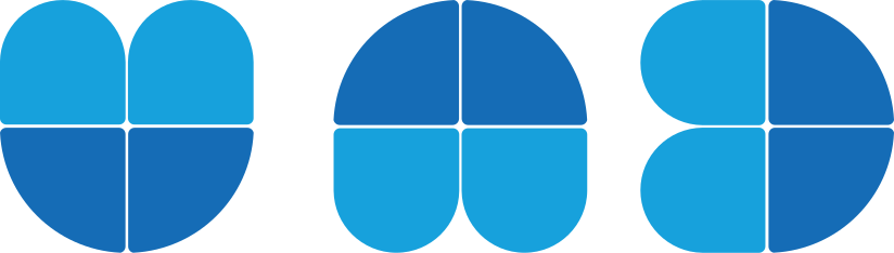
Going with a single color helps push the concept of C.
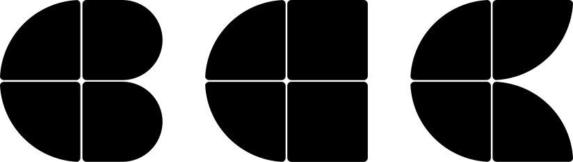
So, is that middle one a backwards D or a sideways A?
D for Designer Program
BrickLink: “The Designer Program icon creates a ‘D’. When rotated, it symbolizes an open window and the opportunities the Designer Program offers expert creators.”
With my cranky hat still on, I have all sorts of issues with the imprecision of the language being used in these descriptions. The Designer Program icon creates a ‘D’. No. The arrangement of the tile shapes in the icon creates a ‘D’. When rotated… to what degree, to what angle? The viewer is having to do a lot of cognitive gear grinding to interpret the symbols as suggested.
So, rotated, this represents an open window and opportunities. Window does not look open to me. Looks like the muntins are in place, window closed. Are you sure it does not represent the A in this alphabet?
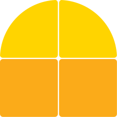
What if it is rotated this way, is it still a window? Looks more like a shield. No, wait, it is the U in DOTSfont.
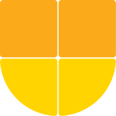
This whole “what it looks like when it’s rotated” business is absolutely inane. Maybe you ought to concentrate on making the letters look like letters when they are in the orientation they are supposed to be or come up with some other iconography altogether.
A final note about D. I think renaming “BrickLink Designer Program” to “Designer Program” is a case of shooting oneself in the foot. Using “BrickLink” in the branding of the program clearly separates BrickLink from LEGO Ideas Designer Program. If everything gets truncated to simply Designer Program some cachet is lost.
Studio icon
My reaction was: “Is that the Windows icon?” Nope. But Google uses those four colors in that sequence.
BrickLink: The Studio icon represents the four core BrickLink products coming together into one creative system and is represented by the letter ‘S’.
Um, okay, what the hell are the four core BrickLink products? Honestly I have no idea what is trying to be communicated. Studio is a product. Designer Program is a program. Marketplace is a service platform. I am clearly missing something, and if a statement is going to be made, it ought to be clear. If you want to make a visual statement alluding to four things coming together I would suggest interlocking puzzle pieces. That’s probably not going to work at a tiny scale either. Your icon, whatever it is, should be communicating one idea and one idea only. And it should communicate that immediately. Icons are not complex thoughts or novels.
Now let us look at the color and immediacy. Here is the S icon along with S in black Avant Garde Bold in a couple sizes, and again with the colors swapped.

It is pretty evident immediately that the large solid Avant Garde S communicates first, then the smaller Avant Garde S, then the rest absolutely fail in comparison. If S is what you are trying to communicate, then the solid standard letterform is what is immediately recognizable and no cognitive effort needs to be applied. As the icon S gets smaller it just becomes a color blob. Coloring the Avant Garde S is also a losing proposition at a small scale.
In the press release we are shown the BrickLink logotype in white against blue. Are the icons also going to appear in the navigation against that blue? Assuming the icons are not going to be paired with descriptive text, here is what we get.

That is not too successful, is it? The blue-on-blue is a problem, the proximity of the icons to one another is a problem, it kind of reads “BDSM” (probably not the best choice of letter sequence there) and scale-wise they dominate over the actual logotype. So, what do we do? Let’s try putting the icons against white in boxes.

Well, on the potentially positive side they now definitely look like buttons. On the down side the icons are now smaller, the cross lines are becoming less distinct, and with the dark contrast of the background blue against the white rectangle the yellow against white is becoming comparatively low in contrast. In proximity to the relatively clear and distinct letterforms of the logotype, the icons at this scale lose their communicativeness as letterforms and become simply colorful designs. Now the viewer is tasked with either experimenting to find out what those things are and what they do, but without being paired somewhere at some point with a label (S is Studio) they are just going to be abstract geometrics. Once the viewer does learn what the icons are, they are then tasked with remembering as the icons are not obvious forms.
There are a whole world of potential solutions out there, but in terms of communicative immediacy, how about this:

That solution is far more immediately communicative, is it not?
There are going to be design challenges needing to be overcome regardless of what color background the icons are placed against. The color and value of a background that works with yellow is not necessarily going to work for dark blue. As a designer you would like to have one solution that you can carry thematically throughout the site and into whatever other media that may be necessary. Will this work in print, will this work in embroidery, and so on. The icons may be somewhat successful at a scale of a couple inches or 6 millimeters or what have you, but at small sizes like 24 pixels they are going to be not successful. They are just not going to clearly reproduce, and thus not successfully communicate. Depending on what you do with the icons they could become a vibrating hellscape.
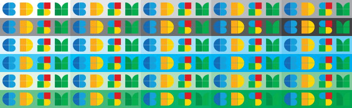
Not sure who was thinking what when it came to designing blue and green icons that are supposed to live in an environment with a lot of blue and green, plus the promise of blue and green parrots, but I guess we will see. Oh, a side note for whatever little it is worth: I notice that the light blue in the S icon does not match the light blue in the C icon.
Moving on.
An informal survey of a few people came up with the following descriptions for the icons. Some did interpret them as alphabet characters. People were shown the icons on a piece of paper with icons about 2-1/2 inches square. Interpretation at this size may be different than interpretation on screen at 36 pixels as there is less detail available when the image gets that small. Anyway, here we go, letter by letter.
Community icon
- ass end of a turtle sideways
- side angle of a butt
- C B
- C
- sporting goods
- a cartoon fish in profile
- big lips
- Bubbles from the PowerPuff girls after being hit with a freeze ray
- a few I don’t knows
Marketplace icon
- a building
- a crown
- a chef’s hat
- saloon doors
- fern
- agricultural supplies
- M
- kinda looks like a vest or a shopping bag
Studio icon
- S
- S
- S
- a duck, I guess
- mega food corp
- several I don’t knows
Designer Program icon
- chat platform
- D
- D
- cartoon bullet
- cheese wheel
- I D
- some I don’t knows
And some more generic comments:
- Letters (M, C, S, D), Google colors.
- primary colors, 1970s, green-earth, blue-sky, sun-yellow, mixed colors-??
- I debated on saying “plant” for the green guy but went with “earth” to go with the sky and sun words. The green guy definitely feels plant/grass like…color plus the top two quadrants feel blade-of-grass-esque…the others didn’t ring a bell.
Of particular note is that no one noted any of the icons as being indicative of their namesakes nor their claimed representation. No one said the M represented a book or a marketplace or a catalog. No one said the C represented a community or a sideways blue heart and a smile. No one said the D represented a design program. No one said the S looked like a software platform or the merging of four core components. If the goal was to create icons that looked like letters, then that was marginally successful. If the goal was to convey these other concepts, that’s a complete fail.
Honestly, if the PR piece simply came out and said the M is for Marketplace and the D is for Designer Program and C is for Community and S is for Studio and left it at that BrickLink would have spared themselves this critique and perhaps more to come. Sometimes calling a duck a duck is better than calling a duck a feathered flying and swimming harbinger of quacking in an attempt to aggrandize the duck.
I would hope that BrickLink could learn something from the design critique, but communication is not their thing, and now it appears that quality is making its way into their visual language as well.
Sadly, the BrickLink motto seems to be: if it works, break it. The lower case bricklink logotype with the little blockhead that has been in use the last 10 years or so is fine. Absolutely fine. Businesses need a really damned good reason to change the branding, and this latest effort, while maybe well intentioned, rates sub par.
From a design standpoint the icons are not needed. Somebody seems to think that candying up the interface is a thing that needs to happen. The reality of the UI/UX is that including these elements is just introducing visual noise and therefore cognitive friction. Employing simple old Helvetica Bold C, D, M, and S would communicate C, D, M, and S much more quickly than multicolor DOTS tile assemblies.
Quoting the Steve from above:
“The refresh of the wordmark and icons celebrates everything the community has built and recognises the breadth of experiences that are now available on BrickLink.com.
The bullshit here is deep. It is not fresh bullshit. “Everything the community has built…” The community would appreciate some candor and respect. Also the majority of what the community has built is due to a very very small handful of people, and if Mr. Peck and Ms. Schaffer ever catch a cold you are totally fucked.
Simplicity has been key in the designs because they need to help anyone visiting the website to find what they’re looking for at a glance.
Absolute and total design fail. You know, it would not be unprecedented for BrickLink to announce something and not deliver it. In this instance it would be for the better.
Inspired by Dan’s original idea as well as the spirit of community past, present and future, the refreshed icons meet our users’ needs…
Fuck. They do not. The users’ needs are being ignored. Dude, you admit this yourself at the end of the PR piece. For chrissake, the last thing the users need is a new logotype and a bunch of half-assed icons.
…while standing as a strong link to the heritage and the future of the BrickLink brand.
I, for one, wish that BrickLink would stop trotting out Dead Dan. The site is so far gone from his vision. So far gone. Putting lipstick on the pig isn’t going to reincarnate what the site was in the past.
It’s great to know that connection is so strong throughout the design.
Convince me.
Experienced me expects the impetus for branding change was one of two things: new guy comes on board in charge and needs to put his stamp on the company. Does not matter if it is good or not, does not matter if it is effective at communicating, does not matter if it works, as long as it is his. Either that or some suit somewhere has declared by fiat that the logotype needs to have a capital B and a capital L and that’s that, end of discussion. Cynical me thinks the story goes: “Oh shit, we’ve screwed up again, what can we do to distract the membership from the latest fuck up? Larry, quick, tell the cleaning lady I need her to have her nephew come up with new branding by the end of tomorrow.” But, hell, with BrickLink it could be alien mind control.
I sent the rebrand elements to some fellow designers for their reactions. Here is a sampling:
Who did the designs? I gather it was not a pro.
Are you working with them in any design capacity? They could use some help.
New logo for BRICKLINK needs more work:
- The thin spaces featured in the letters will end up as very weak-looking typography when this logo is reduced. It will feel like a mistake.
- I understand the idea behind the LEGO block making the “L” but it doesn’t work. The scale is wrong and the icon not defined enough. It will again “be a problem” when reduced.
Four symbols:
- Nothing crisp about them. Same small thin line problem as above.
- Who cares what the symbols might mean when they are flipped upside down and tumbled about? Work harder to make them readable as an S, M, D, and C. Colors are fun but palette needs to be fine tuned. They don’t work yet.
Looks like the start of an idea that hasn’t been fully explored.
I smelled BS as soon as I read: “The blue on top represents the skies in that BrickLink has no limits on where it can go.”
A couple closing thoughts. Rebranding should not be implemented gradually over the coming days and weeks and months. It should be done whole hog all at once. Otherwise it is schizophrenia in action. If the goal of this rebranding is to make the site more navigable then it is a failure about to happen. But maybe BrickLink will prove me wrong. I will be lurking in the forum to see what the membership thinks.
33734